|
|
Post by Jaselynna Hawk on Feb 27, 2007 14:29:25 GMT 7
Well it's simple really..rate the siggy above you on a scale of one to ten..
Example: 10/10; 3.5/10; 6/10
Starting with mine |
|
|
|
Post by Bobby Ryan on Feb 27, 2007 14:55:44 GMT 7
8.8/10
yaay  |
|
|
|
Post by Jaselynna Hawk on Feb 27, 2007 15:00:40 GMT 7
9/10 Don't get me wrong I love it. Just the one thing i don't is the Scriptina font. Sorry i just feel another cursive font would have fit better  |
|
|
|
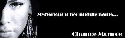
Post by Chance Monroe on Mar 1, 2007 5:39:22 GMT 7
10/10, I absolutely love it.
|
|
|
|
Post by Jaselynna Hawk on Mar 1, 2007 12:47:01 GMT 7
6.5/10
It is a bit plan for my liking, but then again you should see the old signatures I use to make. Maybe you should add another picture? or color?
|
|
|
|
Post by Shane Daughtry on Mar 1, 2007 15:12:18 GMT 7
9/10. The pic of brittany murphy on th left is cool.
|
|
|
|
Post by Jaselynna Hawk on Mar 1, 2007 15:18:19 GMT 7
6/10 Not bad. But maybe a blend. A font that matches and goes well with it? I get the whole DJ bit, but i dont know, i just dont feel it.
|
|
|
|
Post by Sadie Iragorri on Mar 2, 2007 9:47:41 GMT 7
[/i] better then my ugly one.[/size][/ul] |
|
|
|
Post by Jaselynna Hawk on Mar 2, 2007 11:24:36 GMT 7
6.5/10
Maybe a name? Some other pictures? I don't know it is majorly missing something though.
|
|
|
|
Post by Bobby Ryan on Mar 2, 2007 19:22:52 GMT 7
uhh.. back to me lol on you lol 8.8..
trust me Scriptina is the only one that went well with it lol.. i downloaded a whole bunch of cursive fonts just to see what would work with this but only Scriptina did.. i dont even really like that font lol.. mind you i like it on the sig lol and a few other sigs but usually i dont like it.
|
|
|
|
Post by Jaselynna Hawk on Mar 3, 2007 11:49:06 GMT 7
9/10
Have you tried Porcelain? or Windsong? They might look good. Or do your last name in one and first name in the other? I like both of them and together they look good anywhere.
|
|
Kaylee Ann Clark
Student  [M:800]
whisper sweet nothings && give me soft kisses ...
[M:800]
whisper sweet nothings && give me soft kisses ...
Posts: 118
|
Post by Kaylee Ann Clark on Mar 6, 2007 22:47:32 GMT 7
8/10 It's a nice blend and the colors are nice but I think that the fonts could be better, or do something more with the fonts. The little font isn't that great.
|
|